
In this tech-centric, high-paced world, we’re often talking about advertising and marketing online and over mobile. But when it comes to really grabbing people’s attention, sometimes a good, old-fashioned sign can be your best bet. More than half of small-business owners find in-store signage and graphics effective in attracting customers, according to the results of a nationwide survey commissioned by FedEx Office.
The survey — which polled more than 500 small businesses in the U.S. this spring — also showed that 64 percent of millennial small-business owners (age 18 to 34) place value on creativity in graphics and signage. By contrast, their baby boomer counterparts (age 55 and older) place higher emphasis on simplistic designs.
Whatever your preferences, the way a sign is designed can have a significant influence on a company’s ability to acquire new customers.
“Best Buy discovered that about 17 percent of its customers were people who did not intend to stop there but did so specifically because they saw the sign, which is well linked to their brand and overall marketing,” says Sapna Budev, director of strategic initiatives for the Alexandria, Va.-based International Sign Association. “Who hasn’t been driving down the street, stopped at a store and made a purchase, merely because they saw the sign?”
To get the most out of your signage, Budev believes there are three important design principles all business owners need to keep in mind when designing banners, posters and other signage.
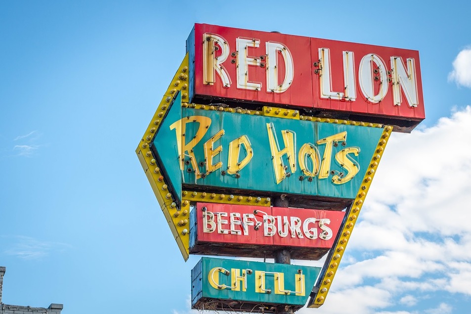
- Compelling color. The choice of color plays a huge part in a well-designed sign. Think of “Coke red” or “McDonald’s yellow.” Often, color can help convey a brand’s identity.
“Studies have shown that 80 percent of the recognition of a trademark is due to its color,” Budev says.
Another important consideration: trendy colors. Some business owners may feel compelled to convey their personality via signs that use current, modern colors. But “care should be taken to consider longevity when designing static signage,” Budev warns. “Today’s color of the year could be tomorrow’s eyesore.”
- Contrast for readability. A sign’s contrast will usually determine its readability. Contrast, therefore, is a huge factor for any engaging sign.
“Most signs will include either text or graphics in the foreground, with a continuous background color,” Budev explains. “The contrast between these two items is critical to the viewer’s retention of the content.”
For example, you might consider a dark color on a very light background, or the opposite of that — black on white or white on blue. Pairing similar colors can decrease a sign’s readability.
“However, a weak color contrast can be strengthened with an outline or drop shadow around the foreground lettering,” Budev says. “Adding a border around the text or graphic also increases reading speed.”
Read Full Article Here: 3 Design Tips for Creating Signs That Attract Customers
